PyQtricks
Advanced tricks and hacks for PyQt (and PySide)
Layout managers
2021-11-23 | Categories: QWidget, Layouts, Guide linesIn the early age of the Web, websites had very basic layouts.
The contents were very simple, based on a concept of page similar to that of pages
of a book: titles, paragraphs, and some images or tables that usually occupied a
single “block” or paragraph of the browser window.
With the advent of more advanced contents, web page layouts became more complex, with the addition of headers, columns, menus, etc, more similar to a newspaper or magazine.
At that time, there were very few and standard screen resolutions:
- 640x480
- 800x600
- 1024x768
There was a practice of putting an alert or small banner at the bottom of each page, saying something like “Best viewed at 1024x768”.
Tables were the main resource for page layouts, but they often created important readability issues, as the contents of tables relied on fixed size-based elements: font sizes, and images.
A page created for a smaller screen would have shown an ugly layout, with weird
empty spacings, and text blocks being too wide or too tall.
A site designed on bigger screens would have forced the user to scroll too much
in both directions, or caused text blocks with too narrow widths, making them
very annoying to read.
In early 2000s, the W3C began suggesting usage of CSS for layouts, with some issues known at the time of the “browser war”: using dynamic elements meant that the web page could be shown at its best by limiting the requirement of scrolling and making the whole browsing experience much better.
In the last decade of Web Design, the term “responsive design” has become common
and its usage is almost mandatory nowadays.
The concept is that a website should be able to adapt its contents no matter the
screen it’s being shown, and that’s because there’s no standard screen resolution
anymore.
This concept is mostly predated by the idea of layout managers in almost any UI toolkit that emerged in the 90s: the contents of a window should adapt to the screen in order to take advantage of all the available space.
Obviously, the requirements of a web page are different from that of an UI, but the idea remains:
- a window should try to optimize its size, avoiding unnecessary blank spaces if not for usability and design purposes (elements belonging to different “sections” should not be too close, and an overcrowded interface may be confusing for the user;
- elements should be shown at full, or expand as much as possible, especially if they are displaying data (text, images, or data);
- if the window is made smaller, all elements must remain usable (and readable);
- if the window is made bigger, elements that could use extra space should take advantage of that;
“I don’t need a layout, my UI looks fine as it is”
One common misconception is that what you see on your screen is what users will see on theirs. The reality is that it almost never happens, because the user may:
- have a different default font;
- the choosen font is not available, or has a different version;
- have a font scaling option;
- use a HiDPI setup;
- use a different Operating System and/or a different Qt style;
- have a different version of the toolkit that draws widgets in a slightly (but still important) different way;
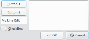
Let’s suppose you created the following layout in Designer:
But the user has a much bigger default font size.
See what the same UI file would give as result:
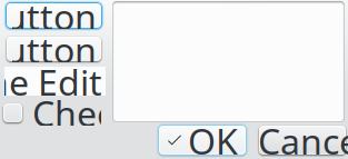
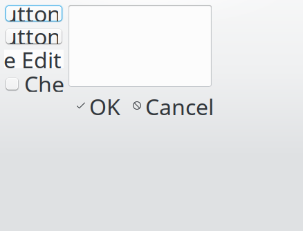
The logical choice would be to resize the window, but will it work?
Now, consider the same using a proper layout manager:
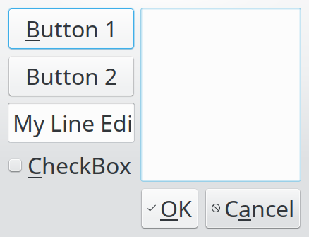
Obviously, the window is bigger, but that’s expected: bigger fonts require more space in order to show their text.z
Project maintained by MaurizioB Hosted on GitHub Pages — Theme by mattgraham